It has been scientifically established that while studying information, we will grasp the analysis of data displayed visually much quicker and more effectively than the words of a long text that represents the same.
Reading a cluttered text makes it much more complex and time-consuming to absorb necessary and helpful information. Still, you can present the same information graphically in an understandable way to everybody who comes across it.
Because of this ongoing advancement and improvement, most data are displayed visually to save time comprehending analysis.
Data visualization displays information using graphs, presentations, charts, and other visual content. It is currently at its peak.

Moreover, data visualization tools are beneficial to a company’s development since they promote better and more efficient communication, which is very crucial for a successful project kickoff and the project generally.
Furthermore, they boost content understanding and have a far more appreciable impact. Charts are one of the most commonly used visual representations of data. Hence, it’s critical to understand how to choose the right chart type for your data, because, for instance, the monthly budget data needs a different chart compared to user engagement data.
We bring you the most excellent chart-making tools to make it easier to visualize your data.
So let’s start!
Infogram
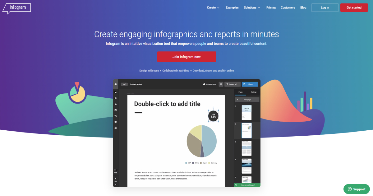
Infogram is a popular chart creator that allows you to create interactive infographics quickly and effortlessly.
This tool will enable you to generate a variety of animated visual displays of data, which 30,000+ users find helpful and necessary. It allows users to use pre-built graphs and charts and create customized designs.
This platform is excellent for real-time collaboration, used in various industries such as marketing, education, and media. The program is free to use with limited features in terms of pricing.
The pro plan costs $19 per month. They also provide other packages and the possibility of searching for a one-of-a-kind package if one is required.
Visme
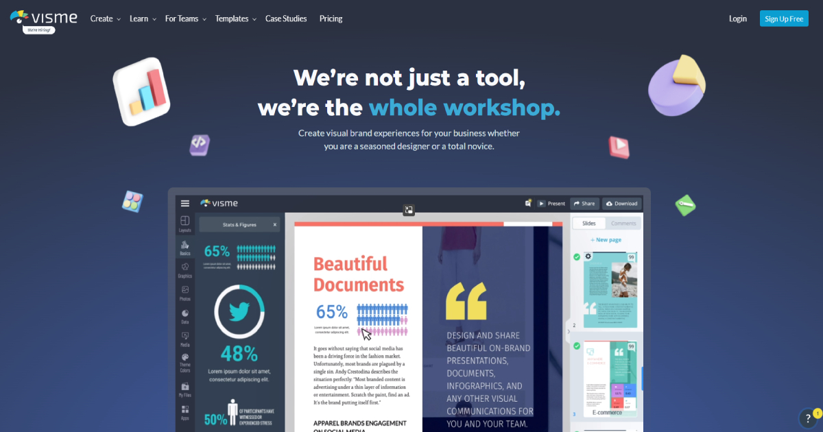
Visme is a cloud-based, all-in-one visual data visualization application. It offers thousands of ready-to-use chart and graph styles and the option of adding video or audio to their material.
If someone does not comprehend the notion of using this tool, they can gain a general understanding by watching videos or reading the program’s help.
Visme has earned the trust of over 6 million users by allowing users to share their material in any way they desire.
A basic plan is $25 per month, with additional options available for individuals who require a more comprehensive package.
Lucidchart
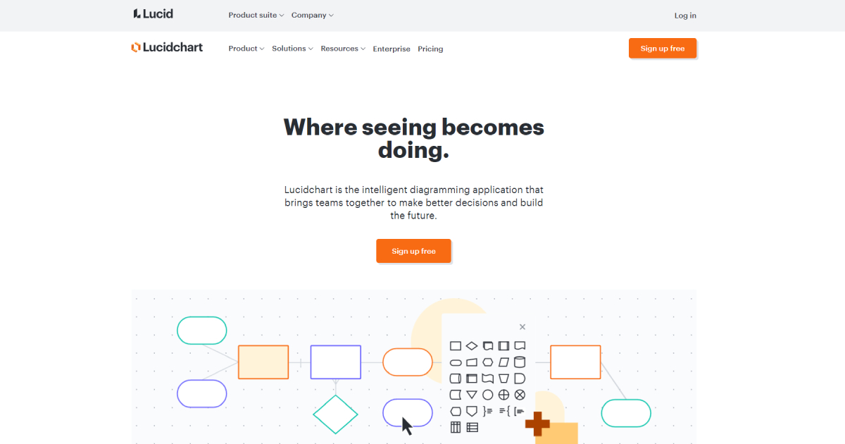
Lucidchart allows users to examine data online using a variety of data visualizations, and the program offers you different suggestions based on the monitored data. This program is an intelligent all-in-one utility because it provides users with over 500 diagram designs.
It also enables users to collaborate on projects and integrate with any platform where you can display your projects.
Individual packages cost almost $8 per month, while team packages cost $7 per person and require a three-person team.
Draw.io
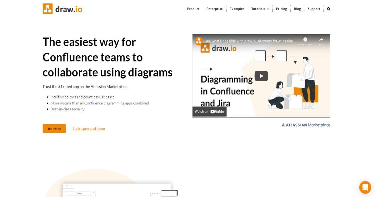
Draw.io enables you to draw and create charts and diagrams of your choice to convey your data as clearly as possible. The chart-making software requires no prior knowledge and is very simple to use.
The first step is to choose a location for your creation. After that, you can utilize the white sheet and tools to generate imaginative visual data.
You may safely and securely share your design online, and many options for modifying shapes and colors add to the visual appeal of your product.
You can try Draw.io for free and enjoy a variety of options for creating the perfect chart.
Canva
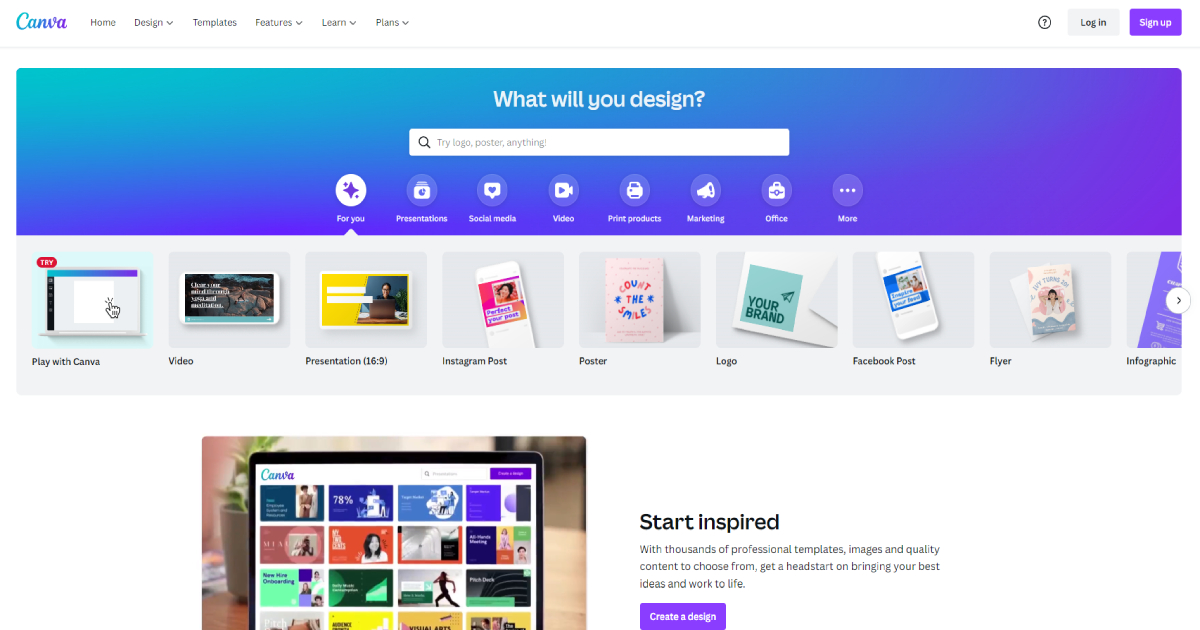
Canva is one of the most popular tools for producing charts, diagrams, and graphs due to its simplicity, which allows any user to create a professional-looking product.
This chart-making tool offers a variety of styles based on different factors, including the scope of the data, the platform on which you can publish it, and so on. When you use Canva, you save time because of its ease.
Also, the sophisticated and demanding style of the final chart gives the impression that you put a lot of effort and time into your project. Users can quickly save and share the final chart by selecting a specific option.
This tool offers a free version with basic options for creating visual data. Moreover, for $12.95 for up to 5 users, you can upgrade to a pro plan that includes many more functions.
Conclusion
When you use a tool for a visual representation of all forms of information and data, you will better comprehend the material.
Thus, you should select a charting tool that will improve the presentation of your project.