A trendline is also known as the line of best fit, and it is a straight as well as a curved line in a chart that will show some of the general patterns or we can say that it gives the overall direction of the data.
This analytical tool is basically used to present or show data movements that happen over a period of time or you can also say it shows a correlation between two variables.
So a trendline looks similar to a line chart, but it also doesn’t connect to some of the actual data points that a line chart is able to do. We can say that this is the best-fit line that shows the general trend that happens in the overall data, this also ignores all different types of statistical errors and also some of the minor exceptions. In some cases, we can also use this to forecast different trends.
How to make a trendline in Excel?
Unfortunately, Excel does not provide you with templates for the trendlines, that’s why you need to follow the below steps to add a trendline in Excel:
For this, you need to visit a chart, and then you need to select the data series for which you are willing to draw a trendline.
Right-click on the chart and then select Trendline.
Right-click on the data and select Add Trendline.
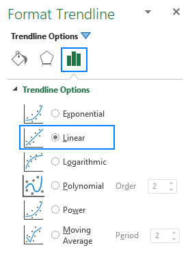
Select and choose the trendline type for your chart.
You need to select the number of periods you want to include in your trend.
How to insert multiple trendlines in the same chart?
Microsoft Excel is now giving an option to adding more than one trendline to a single chart. You can add more than one trendline by using two are two different methods.
Add a trendline for different data series.
Select and upload a trendline that you want on your chart.
If you have more than two data series than you can follow these steps :
Right-click the mouse button on the data points of your interest and choose then choose the type of Trendline you want to upload from the menu.
Your screen will be displayed with a Trendline Options tab that is available on the pane and then you can choose the desired line type.
Keep on repeating the steps for as many other data series you want to upload.
As the result select each data series with the trendline so that matching colour can be connected.
For the other way out you need to follow these steps-
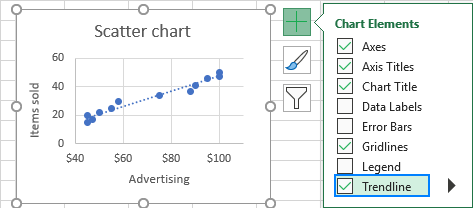
You can click on the Chart Elements button, and then you need to click on the next arrow so that you can choose a Trendline and then select the type you want. Then the excel will show a particular list of data series that will be plotted in your chart. Then you can pick the needed one and click OK.
Try and draw different trendlines for the same data series.
You can also make two or more different trendlines and that can be for the same data series, and then you need to first add a trendline as usual, and then you need to do follow up the same process.
Right-click and select the type of data series you want and then you can select the option to add a trendline that is from the context menu, and in the same way you can choose a different trend line for different types on the pane.
Click and select the Chart Elements button, and then click on the next arrow so that you can add a Trendline and then you can choose the type you want to add.