In the ever-evolving world of web design, where aesthetics and functionality collide, mastering the art of layout manipulation is crucial. Picture this: you’ve crafted a beautifully designed webpage, but that one paragraph just doesn’t sit right—it feels lost in a sea of content or overshadowed by eye-catching images. The good news? With CSS, the power to reposition that wayward text is at your fingertips! Whether you’re looking to create visually striking compositions or simply tidy up your layout, understanding how to move a paragraph can transform not only its appearance but also how users engage with your content.
In this article, we’ll delve into the ins and outs of positioning text using CSS techniques that are both intuitive and powerful. From flexbox to grid systems, you’ll discover various methods to seamlessly drag paragraphs into their rightful places on any webpage. If you’ve ever felt frustrated by stubborn text alignment or awkward spacing issues, fear not—this guide will equip you with practical solutions and creative strategies. So buckle up as we navigate through the fascinating realm of CSS positioning; it’s time to take control of your paragraphs like never before!
Basic CSS Properties for Positioning Elements
Understanding the basic CSS properties for positioning elements can transform how you structure and design your web pages. The `position` property is pivotal, with values like `static`, `relative`, `absolute`, and `fixed` each offering unique control over element placement. For example, setting an element to `relative` allows you to adjust its position in relation to where it would normally sit in the document flow, enabling subtle tweaks that refine your layout without disrupting surrounding content.
Another essential property is `z-index`, which works hand-in-hand with positioning strategies, determining the stacking order of overlapping elements. This becomes especially useful when layering images or text over backgrounds, ensuring focal points are emphasized despite complex layouts. Furthermore, don’t overlook margin and padding; while they don’t directly change an element’s position type, they provide crucial spacing adjustments that can enhance visual hierarchy and readability within a paragraph — drawing attention where you need it most.
Lastly, consider using media queries alongside these positioning properties for responsive design. Tailoring the placement of paragraphs based on screen size not only improves user experience but also optimizes legibility across devices. As you experiment with combinations of positioning methods and spacing techniques, you’ll unlock endless creative possibilities in your web design endeavors!
Using Margin for Paragraph Adjustments
Using margin for paragraph adjustments is an essential technique that allows web developers to control the spacing and overall aesthetics of text content effectively. By manipulating the `margin` properties in CSS, you can create visual hierarchy and enhance readability without altering the actual text structure. For instance, applying a larger bottom margin to a paragraph before a heading can draw attention to it, signaling to readers that they should pause and absorb information.
Moreover, margins facilitate fluid design—especially on responsive sites where screen sizes fluctuate. Implementing relative units like percentages or viewport-based measurements (like `vw` or `vh`) ensures that your paragraphs remain well spaced regardless of device size. This flexibility enables you to craft designs that feel intentional rather than haphazardly formatted, engaging users more deeply with the content. Additionally, bear in mind the importance of consistency; using a standard margin value throughout your site can foster familiarity and allow viewers to navigate with ease.
Lastly, don’t overlook the creative potential of negative margins! When used wisely, negative margins can create overlapping elements or tightly group related paragraphs together without disrupting individual readability. This method breathes an artistic flair into your designs while maintaining clarity—making each section stand out distinctly within its context. In all these ways, mastering margin adjustments transforms simple paragraphs into dynamic components that enrich user experience across digital platforms.
Utilizing Padding to Alter Paragraph Space
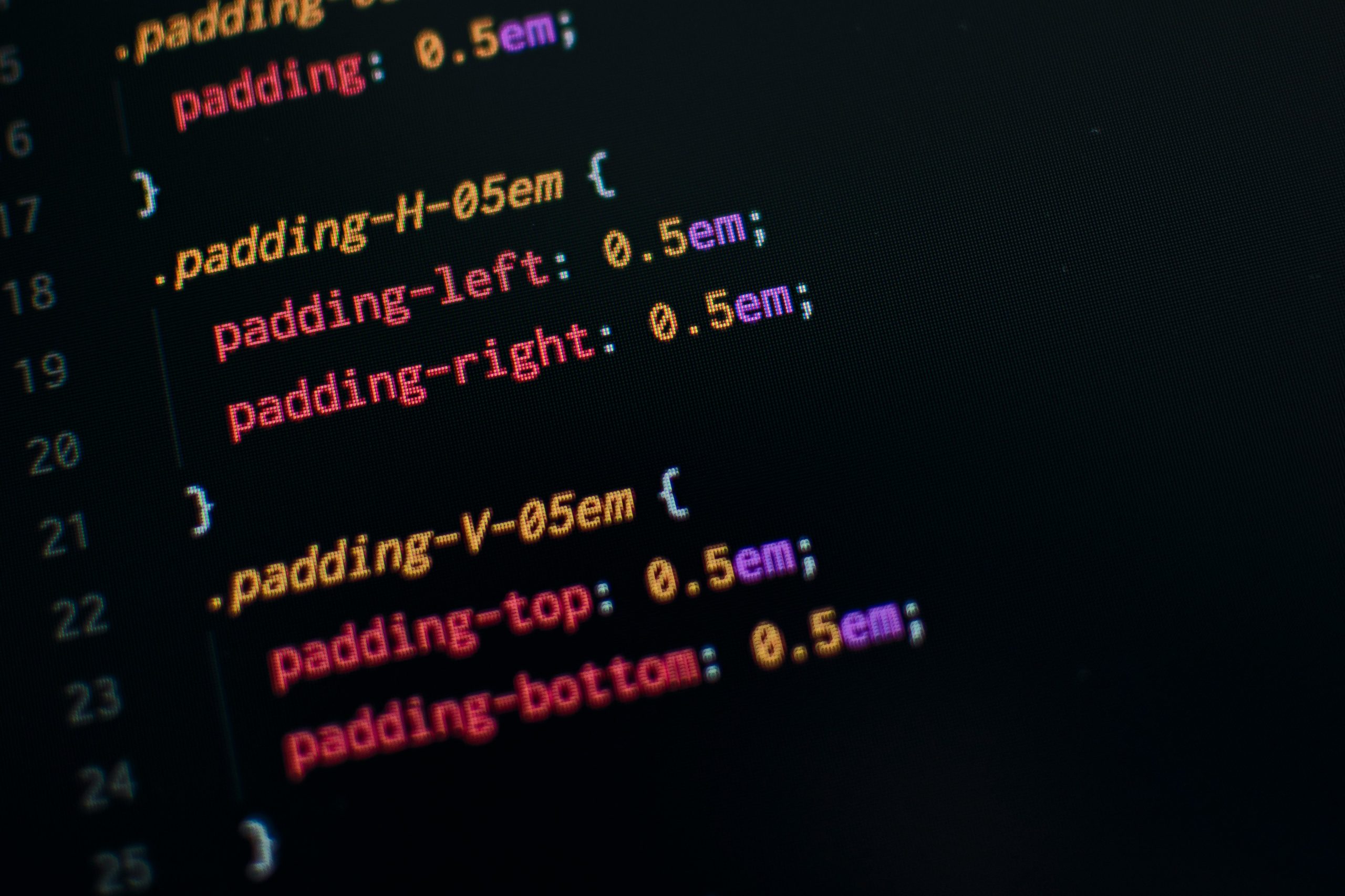
When it comes to fine-tuning the space around your text, utilizing padding can be a game-changer. Instead of merely adjusting margins or relying on whitespace to separate paragraphs, padding brings a refined control over the internal spacing within an element. By applying padding to a container that wraps your paragraph, you instantly affect how it breathes and interacts with other elements in your layout. For instance, adding ample padding will not only draw attention to the text but also enhance readability by preventing crowding against other visual components.
But let’s dig deeper: think about how emotions and tones are conveyed through visual design. A well-padded paragraph can evoke a sense of warmth and comfort, creating an inviting atmosphere for readers. Adjusting the top and bottom padding separately allows you to manipulate vertical spacing according to content needs; for example, more space after a compelling quote can emphasize its importance without overwhelming adjacent text blocks. This thoughtful use of CSS paddings transforms simple paragraphs into deliberate design choices that cater not just to aesthetics but also user engagement—encouraging visitors not just to read but to linger over each word.
Exploring the Float Property for Layouts
The float property in CSS is a versatile tool that allows developers to create dynamic and visually appealing layouts. By moving elements to the left or right of their containing block, you can manipulate text flow around images or other content. This technique not only enhances the aesthetics of your design but also improves readability by creating a more engaging reading experience. For example, imagine wrapping text around an image instead of having it positioned below—this subtle shift can elevate your web page from standard to striking.
However, it’s essential to view floating as both an art and a science. While floating elements can add flair, overusing them without proper containment might lead to frustrating layout issues where parent containers collapse or content overlaps chaotically. To master the float property, consider pairing it with clearfix techniques or modern layout methods like Flexbox and Grid for robust designs that retain flexibility while avoiding common pitfalls associated with floats alone. As we navigate through these methods, exploring how floats influence the natural flow of paragraphs opens up exciting possibilities for creative expression in web design.
Implementing Flexbox for Responsive Design
Implementing Flexbox for responsive design revolutionizes how web developers approach layout challenges. With its powerful alignment capabilities and dynamic resizing features, Flexbox simplifies the creation of fluid, adaptive interfaces that cater to a variety of devices. When incorporated into your CSS, this powerful module allows you to manipulate the positioning of elements with ease, ensuring that your paragraphs—whether they’re standalone sections or part of a larger grid—react seamlessly to changes in viewport size.
Imagine leveraging Flexbox’s ability to center text both vertically and horizontally within a container. This not only enhances readability but also adds an aesthetically pleasing symmetry that beckons users’ attention. Key properties such as `flex-grow`, `flex-shrink`, and `flex-basis` empower you to dictate how space is allocated among items in a container dynamically. As content changes or screen sizes fluctuate, these properties ensure that paragraphs maintain their intended structure without sacrificing visual appeal or user experience.
Moreover, using Flexbox encourages a mobile-first mindset by allowing developers to prioritize content placement based on context rather than aesthetics alone. By combining media queries with Flexbox structures, you can effortlessly switch between orientations and layouts while maintaining consistency across all devices. This approach not only optimizes loading times but also fosters greater engagement by inviting users into an interface designed specifically for them—an essential factor in today’s diverse digital ecosystem.
Leveraging Grid Layout for Precise Control
Grid Layout offers a powerful and precise way to control the positioning of elements within your web design, especially when it comes to moving paragraphs around. By defining a flexible grid structure, you can allocate space for specific content areas while ensuring that your text flows harmoniously with the overall layout. This method provides not just control but also consistency across different screen sizes—a crucial advantage in today’s responsive design landscape.
Imagine needing to reposition a paragraph without disrupting its surrounding elements. With CSS Grid, you can assign columns and rows explicitly to a paragraph instead of relying on margins or padding adjustments that might affect neighboring content. Using properties like `grid-column` and `grid-row`, you gain fine-tuned placement ability, seamlessly shifting the text into any desired area of your layout without losing alignment or aesthetics. Consider setting up grid-defined zones where every paragraph resides; this approach not only enhances clarity but also simplifies future edits and updates by maintaining a structured framework.
Furthermore, applying CSS Grid allows for intricate layering effects and responsive behaviors that traditional methods struggle to deliver. For example, using overlapping grid areas can create dynamic visual hierarchies that guide readers’ eyes through your content effectively. As web trends evolve towards more engaging layouts, adopting Grid Layout strategies means preparing yourself not just for today’s designs but for tomorrow’s innovative possibilities as well—making it an essential tool in any designer’s kit.
Conclusion: Mastering Paragraph Movement Techniques
Mastering paragraph movement techniques in CSS opens up a world of creative possibilities for web designers and developers alike. By skillfully utilizing properties like `margin`, `padding`, and the more dynamic `transform`, you can create layouts that resonate with your aesthetic vision while enhancing user experience. Imagine elements gliding into place as users scroll, drawing their focus to key content without overwhelming the design. This subtlety is what separates mundane webpages from captivating ones.
Additionally, harnessing the power of modern layout systems like Flexbox and Grid further elevates your control over paragraph positioning. These tools not only streamline how elements interact on different screen sizes but also encourage a more fluid design approach that adapts seamlessly to various devices. Coupling these techniques with animation libraries can bring a layer of interactivity that engages users, making text not just something to read, but an integral part of a rich visual narrative.
Ultimately, mastering paragraph movement in CSS isn’t just about technical skills; it’s about storytelling through design. Each adjustment creates an opportunity to engage readers in new ways—whether by guiding their attention or sparking emotional reactions through thoughtful placement and motion. As you experiment and refine these techniques, you’ll find your own unique voice in the ever-evolving landscape of web design, transforming standard paragraphs into dynamic components that breathe life into your projects.
