If you’ve ever shopped for a television, tried editing a video, or wondered why your old square monitor doesn’t display Netflix the way your widescreen TV does, then you’ve brushed up against the concept of aspect ratio. Understanding aspect ratios can help you make better technology purchases, improve your multimedia projects, and appreciate how images and video are displayed across different screens.
What Is Aspect Ratio?
Aspect ratio refers to the proportional relationship between the width and the height of a screen or image. It’s typically written as two numbers separated by a colon, such as 16:9 or 4:3. This ratio tells you how wide something is compared to how tall it is.
For example, a 16:9 aspect ratio means that for every 16 units of width, there are 9 units of height. It’s not a measurement of size like inches or centimeters, but rather a shape descriptor.
Why Aspect Ratio Matters
The aspect ratio affects how images and videos are displayed. It determines:
- How much of the content fits on the screen
- Whether black bars appear on the top/bottom or sides of videos
- The overall visual experience, including distortion or cropping
Whether you’re watching movies, designing a presentation, or developing a website, choosing the right aspect ratio can make all the difference in appearance and usability.
Common Aspect Ratios and Where You’ll See Them
Let’s take a closer look at the most common aspect ratios you’ll encounter and what they’re used for.
4:3 – The Classic Format
This ratio was the standard for televisions and computer monitors for most of the 20th century. You may recognize it as the “square” format that was common before the widescreen revolution.
- Used in: Old CRT TVs, early computer monitors, vintage video content
- Benefits: Compatible with older content, more vertical space
- Drawbacks: Doesn’t display widescreen content well; leads to black bars or stretching
16:9 – The Widescreen Standard
Also called “HD format,” this is now the most widely used aspect ratio for TVs, computers, and streaming media.
- Used in: HDTVs, YouTube videos, modern computer monitors
- Benefits: Ideal for movies, games, and presentations; sharp image with modern resolution standards
- Drawbacks: Not ideal for reading or writing documents due to reduced vertical space
21:9 – Ultra-Wide Cinema Style
Commonly referred to as “cinematic” or “ultrawide” format, 21:9 mimics the format used in movie theaters, offering a more immersive experience.
- Used in: Ultrawide monitors, feature films, gaming setups
- Benefits: Wide field of view for movies and games, excellent for multitasking
- Drawbacks: Some content and games don’t support it; black bars may appear
1:1 – Perfect Squares
This format features equal width and height, forming a perfect square. It has become popular with social media platforms, particularly Instagram.
- Used in: Social media posts, design projects, product photography
- Benefits: Consistent appearance across devices; easy to frame
- Drawbacks: Less screen-efficient on widescreen displays
9:16 – Vertical Video
As smartphones have become the primary device for capturing and consuming media, vertical formats like 9:16 have skyrocketed in use.
- Used in: TikTok, Instagram Reels, Snapchat, mobile-first content
- Benefits: Optimized for mobile viewing
- Drawbacks: Not suitable for traditional video platforms or TVs
How to Choose the Right Aspect Ratio
Your ideal aspect ratio depends on how and where the content will be viewed or used. Here’s a quick guide:
- For home entertainment: 16:9 is a universal and versatile choice.
- For photography: Consider 3:2 or 4:3 depending on how you intend to display or print your images.
- For video editing: Match the aspect ratio of your intended platform (e.g., 9:16 for TikTok, 16:9 for YouTube, 21:9 for film).
- For design/layouts: Think about device screens and user orientations. Responsive designs often need to handle multiple ratios.
Black Bars: Why They Appear
Ever watched a movie and noticed black bars on the top and bottom or sides of the screen? That’s because your display’s aspect ratio doesn’t match that of the content. This is called letterboxing (horizontal bars) or pillarboxing (vertical bars).
Rather than stretch or crop video to fit, black bars are used to preserve the original aspect ratio of the media. That’s why widescreen movies may have bars on a 16:9 screen—they’re originally shot in something wider like 21:9.
Aspect Ratio in Photography and Art
In photography and visual arts, aspect ratio can dramatically influence composition. Square images (1:1) offer symmetry, while wide images (3:2 or 16:9) can emphasize landscape and horizontal space. Choosing the right ratio can guide a viewer’s eye and convey emotion.
Many cameras allow you to choose the aspect ratio when shooting, or you can crop images later during editing. Just be careful not to lose key elements of your photo when changing the ratio.
Changing vs. Stretching: Why Proper Scaling Matters
When converting or displaying media across different aspect ratios, maintaining the correct scale is important. Improper scaling can result in:
- Stretching: Content appears elongated or squashed
- Cropping: Important parts of content are cut off
- Letterboxing/Pillarboxing: Black bars appear to fill unused space
The best solution is almost always to preserve the original aspect ratio. You can add padding or resize intelligently using editing software that accounts for proportions.
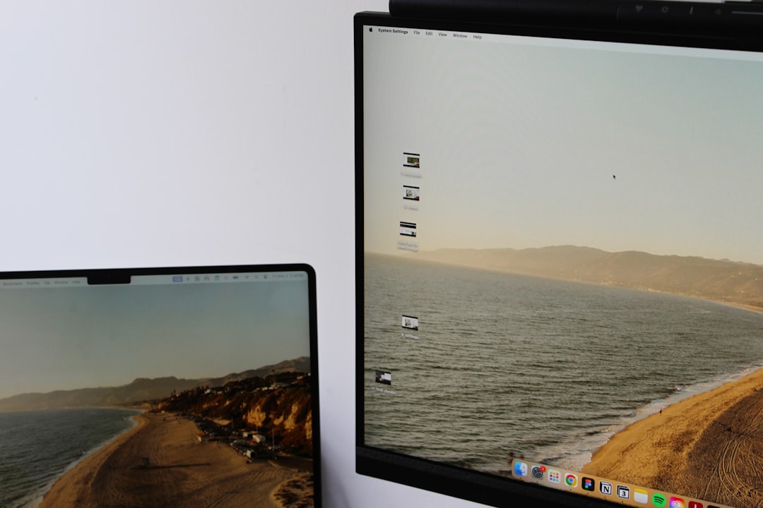
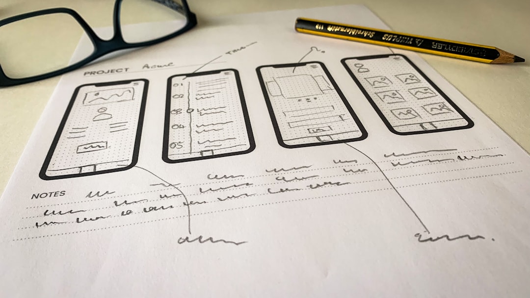
Aspect Ratios in Websites and Apps
Web design today heavily leans on responsive design, where layouts change based on screen size and orientation. This has forced designers to think flexibly and develop assets that can adjust across multiple aspect ratios gracefully.
Interactive elements, video playback, and embedded media must all be designed to perform well on a plethora of devices. That’s why understanding aspect ratios is crucial for designers and developers alike.
Conclusion
Whether you’re behind the camera, on the couch, or in front of a design program, understanding aspect ratios helps you make informed decisions that optimize your visual experience. From widescreen blockbusters to square social posts and vertical mobile videos, aspect ratio shapes how we create and consume media today. Next time you adjust your screen or frame that perfect shot, you’ll know what those numbers really mean—and why they matter.


