Logos are the face of a brand. They serve as the most immediate visual representation of a company’s identity, values, and mission. One of the most essential aspects of logo design is iconography—the use of symbols, letters, or a combination of both to form a distinct mark. As consumer interactions become more rapid and visually-oriented, the demand for a strong and clear visual identity grows. Understanding logo iconography is a crucial step in crafting a memorable and effective brand presence.
TLDR
Logo iconography refers to the strategic use of symbols, letters, or a combination of both (hybrid marks) to create unique brand identities. Symbolic logos rely on visuals, while lettermarks utilize typography, and hybrid marks combine both for maximum effect. The choice depends on the brand’s goals, name length, and target demographics. Each type holds unique advantages and plays a distinctive role in how a brand is remembered and perceived.
Understanding the Building Blocks of Logo Iconography
Logo iconography can be distilled into three primary categories:
- Symbol-Based Marks
- Letter-Based Marks (Lettermarks)
- Hybrid Marks
Each type leverages different visual components to communicate a brand’s essence. Selecting the appropriate format depends on a company’s name, industry, and marketing strategy.
Symbol-Based Logos
Symbolic logos embrace pure imagery and refrain from including text. These logos rely exclusively on a visual element to encapsulate and project a brand’s identity. Well-executed symbol-based logos can function globally, transcending language barriers and enabling fast recognition. They are often abstract, minimal, or illustrative in style.
One of the most iconic examples is Apple’s logo: a simple silhouette of an apple with a bite taken out. Despite lacking any letters or words, the image is instantly recognizable due to its consistent usage and strong brand reputation.
Advantages of Symbol-Based Logos:
- Global recognition: Works across different language groups.
- Memorability: A strong symbol sticks in visual memory.
- Scalability: These logos adapt well across digital and physical platforms.
Challenges: Symbol logos often require a high investment in brand awareness to achieve recognition, especially for newer companies without established name recognition.

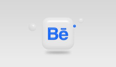
Letter-Based Logos (Lettermarks)
Lettermarks rely on typography, usually focusing on initials or the full name of the company rendered in a stylized typeface. This design strategy is particularly beneficial for businesses with long names, where initials can provide a cleaner, more digestible representation.
Well-known companies like CNN (Cable News Network), IBM (International Business Machines), and HBO (Home Box Office) all use lettermarks effectively. These logos prioritize simplicity and legibility over graphical elements but still require thoughtful typographic design to convey tone and professionalism.
Advantages of Letter-Based Logos:
- Clarity: Easily communicates a business name, especially for acronym-based identities.
- Versatility: Suits both digital screens and printed materials without scalability issues.
- Timing: Easier for younger companies that do not yet have symbol recognition.
Challenges: Lettermarks may lack distinctiveness if the typography is too generic or not supported by a broader visual identity.
Hybrid Logos: Letter and Symbol Integration
Hybrid marks combine both text and imagery, often pairing a unique symbol with a customized wordmark to form a comprehensive and balanced logo. This category offers flexibility and depth by supporting both recognition and readability. Over time, as a brand becomes more established, it may choose to rely solely on the symbol portion of the hybrid logo.
Examples of hybrid logos include Adidas, which displays a stylized mountain (three stripes), paired with the brand name in a custom sans-serif font. Similarly, Mastercard uses two overlapping circles alongside its brand name, uniting visual and lexical components.
Advantages of Hybrid Logos:
- Flexibility: Can be deconstructed depending on usage context (symbol alone, text alone, or both).
- Recognition and Communication: Provides both immediate brand identity and a textual anchor for clarity.
- Strong Branding: Allows businesses to tell more nuanced brand stories through both text and visuals.
Challenges: Might become too complicated if not effectively balanced. Requires careful design to ensure harmony between symbol and lettering.
How to Choose the Right Iconographic Approach
Selecting the correct logo type is not just an aesthetic choice—it is a strategic decision influenced by several factors:
- Brand Age and Recognition: If your brand is already well-known, a symbol-based logo or minimalist lettermark may suffice. For a newer brand, a hybrid format offers versatility and clarity.
- Industry Standards: Certain industries skew toward specific types. Financial institutions often prefer strong lettermarks, while fashion brands might opt for elegant symbols.
- Brand Name Length: Long names often benefit from initials or acronyms. Conversely, short and distinctive brand names lend themselves well to symbol integration.
- Scalability and Context: Consider where the logo will mostly appear—web, mobile apps, signage, printed materials. A good logo should remain recognizable across all platforms.
Best Practices in Designing Iconography
Whether you’re creating a logo from scratch or refining an existing one, adhering to certain best practices can significantly improve the effectiveness and professionalism of your mark:
- Simplicity: A cluttered logo is often confusing. Embrace clean lines and straightforward imagery.
- Consistency: Use your logo consistently across all channels to reinforce brand recognition.
- Adaptability: Test your logo in black-and-white and across scaled sizes to ensure effectiveness.
- Uniqueness: Avoid trends or mimicry. A distinctive logo has a longer shelf life and creates stronger brand associations.
- Typography: For letter-based and hybrid logos, choose typefaces that reflect your brand’s tone—serif for tradition, sans-serif for modernism, script for elegance.
Evolving Trends in Logo Iconography
In today’s fast-changing digital environment, logo designs are increasingly being flattened, simplified, and optimized for screen readability. With the rise of mobile-first branding, scalability and minimalism are more important than ever. Successful brands are developing modular logo systems that include symbolic, textual, and hybrid variations, allowing them to adapt based on platform and context.
For instance, brands like Google and Airbnb use responsive logos that emphasize iconography in small-scale formats and incorporate wordmarks for broader contexts. This modular strategy maximizes recognition while preserving visual identity across devices and media.
Conclusion
The elements of logo iconography—symbols, letters, and hybrids—each play a crucial role in defining a brand’s visual identity. The choice between them should be rooted in strategic consideration, considering brand maturity, industry norms, and communication goals. Ultimately, effective logos do more than just represent companies; they build trust, convey professionalism, and leave lasting impressions.
By understanding the roles and implications of different iconographic elements, designers and business owners can ensure that their logos not only look good—but work hard to support their broader branding efforts.