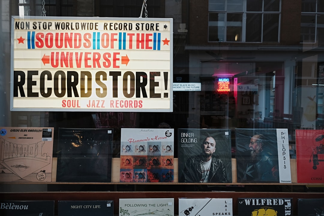
Designing a great logo is only the first step. For businesses that want to display their branding prominently on signage, storefronts, and vehicles, prepping that logo properly is essential. Without the right preparation, even the most eye-catching design might lose its impact, suffer from distortion, or fail to comply with production requirements.
TL;DR (Too Long; Didn’t Read)
To prep a logo for signage, storefronts, and vehicles, start with a high-resolution vector format. Consider how different materials and lighting impact appearance. Be mindful of scalability, color contrast, and visibility. Always collaborate with fabricators or printers to ensure the final product retains your brand’s integrity.
Understanding Where and How the Logo Will Be Used
The first step in logo preparation is knowing where it will appear. Each medium—whether it’s a glass storefront, a vinyl vehicle wrap, or a metal sign—requires slightly different considerations. Materials, distance, viewing angle, and lighting conditions all influence how the logo looks once it’s installed.
Start by asking the following:
- Is the logo going indoors or outdoors?
- Will it be lit (e.g. backlit or halo-lit)?
- How far will viewers typically be from the sign or vehicle?
These questions help determine everything from color choice to material thickness, the need for outlines, or even simplifying the design for visibility at a distance.
Use the Right File Formats
When it comes to preparing your logo for vendors, format is everything. Vector files are king. They scale infinitely without losing quality, making them ideal for large-scale signs and vehicle wraps.
Common vector file types:
- .AI (Adobe Illustrator) – ideal for editing and sharing with designers
- .EPS – compatible with many sign and print systems
- .PDF – easy to view and often includes vector data
- .SVG – web-friendly and scalable, though less common for traditional signage
Avoid sending only raster images like .JPGs or .PNGs for production purposes; these cannot be enlarged without pixelation.
Design for Scalability and Visibility
Whether seen across a parking lot or flying by on a highway, a logo needs to remain legible and recognizable. That’s why simplicity and contrast are critical design elements.
For signage and vehicle graphics:
- Use high-contrast colors – such as dark text on a light background
- Avoid fine lines or tiny details – they may get lost or degrade
- Use bold fonts – sans-serif fonts are typically more readable from a distance

If your logo has an intricate version, consider creating a “simplified” variant for outdoor or mobile use. Consistency in branding is important, but so is function and clarity.
Factor in Material and Lighting Considerations
Different materials can impact how a logo looks once installed. For instance, a logo applied to frosted glass may need added outlines to ensure visibility, while backlit acrylic signs can affect the brightness and color temperature.
Tips for optimizing logo for materials:
- Ask for color proofs – Request a mock-up or sample in final materials before approving full production.
- Test reflectivity – Glossy or metallic materials can behave differently under sunlight versus artificial light.
- Outline all text – Convert fonts to outlines to ensure no font file compatibility issues.

Working closely with the sign maker or wrap specialist helps determine suitable options like laminates, UV protection, and types of adhesive backing needed for the surface in question.
Consider Brand Guidelines and Legal Compliance
Before printing or installing any signage, make sure your designs adhere to branding guidelines and local regulations.
Brand guidelines ensure things like:
- Consistent spacing, color usage, and logo orientation
- Minimum size requirements for readability
- Restriction on logo distortion or component separation
Local signage laws may restrict:
- Logo size and placement for storefronts
- Illumination types and brightness
- Maximum square footage for vehicle wraps
Consult your local zoning board and municipality, especially for outdoor and illuminated signage.
Work With Professionals
Even with the right logo file and creative design, executing signage and vehicle branding takes collaboration. Work with reputable fabricators or wrap shops who specialize in commercial applications.
Professional services typically offer:
- Design review and file prep assistance
- Mockups to showcase how the logo will look
- Installation expertise for durability and compliance
Final Production Checklist
Use this checklist before sending your logo to production:
- ✔ File format: Vector, with outlined fonts and correct color values
- ✔ Sizing: Scaled to specific install dimensions
- ✔ Color profiles: CMYK or spot colors, depending on project
- ✔ Simplicity: No unnecessary details
- ✔ Visibility: High contrast and readable from a distance
Following these best practices helps ensure that your logo doesn’t just look good on a screen—but also shines in the real world on every banner, storefront sign, and branded vehicle.
FAQs
-
What file format should I give to my sign shop?
A vector file such as .AI, .EPS, or .PDF is best. Make sure all fonts are converted to outlines. -
Can I use a PNG or JPG of my logo?
Only for small digital previews. For production and printing, vector formats are needed. -
What resolution should my logo be?
Vector files don’t rely on resolution. For raster images, a minimum of 300 DPI is recommended at final size. -
Will my logo look the same on all materials?
Not always. Materials, lighting, and installation techniques can impact color and appearance. Always request a sample proof. -
Should my logo be in RGB or CMYK?
For print materials like signs and vehicle wraps, CMYK or Pantone Spot Colors are more accurate than RGB. -
Can I customize my logo for different uses?
Yes, as long as changes respect your overall branding. Many businesses use alternate lockups for better fit or readability.


