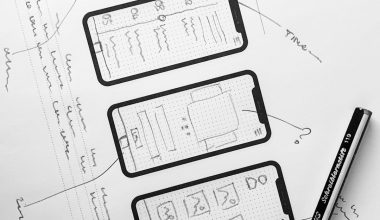
Use Figma for careful mobile About Us UI design, use Framer when you need a convincing interactive prototype, and use supporting tools only when they solve a specific trust problem. A mobile About page is not decoration. It answers one quiet question: “Can I trust this company with my time, money, or data?” The best tools help teams design that answer clearly, test it quickly, and ship it without diluting the message.
TLDR: Figma is the safer choice for structured mobile About pages because it handles hierarchy, components, comments, and design systems with real discipline. Framer is stronger when motion, page flow, and interactive proof matter, such as showing how founder stories, customer reviews, and team profiles unfold on a small screen. For example, a fintech app could test two About page designs with 1,000 visitors and find that adding verified leadership profiles and security badges raises “continue to signup” taps from 14% to 19%. Use Figma to design the system, Framer to prove the experience, and analytics to decide what stays.
What a mobile About page must prove
A desktop About page can afford long timelines, culture photos, and press quotes. A mobile About page cannot. The user is often standing in a queue, checking a company before checkout, or deciding whether an app deserves personal data.
Trust on mobile comes from clarity, proof, and restraint. Good About Us UI design should answer five questions within seconds:
- Who are you? State the company name, purpose, and category clearly.
- Why should I believe you? Show proof, not slogans.
- Who is behind this? Use real names, roles, and credible team details.
- Are you safe? Mention privacy, security, certifications, or policies where relevant.
- What should I do next? Give one clean action, such as “Contact us,” “View reviews,” or “Start trial.”
Figma: best for structure, systems, and serious collaboration
Figma is the most reliable tool for designing a trust-building mobile About page from the ground up. Its strength is control. You can define type scales, spacing rules, buttons, cards, badges, and profile components, then reuse them across the app.
This matters because trust often breaks through inconsistency. A leadership card with one spacing style, a testimonial card with another, and a privacy badge placed randomly will make the page feel careless. Figma helps prevent that.
For mobile About pages, Figma works well for:
- Wireframes: Test the order of content before visual polish.
- Components: Reuse team cards, proof blocks, values sections, and CTA areas.
- Auto layout: Keep designs neat across screen widths.
- Design review: Let product, legal, brand, and leadership comment in one file.
- Developer handoff: Share measurements, assets, and design tokens more easily.
Honestly, it feels like some teams use Figma as a dumping ground for every idea. That is not the tool’s fault, but it creates noise fast. A single About page file can turn into 40 frames, 12 unused hero concepts, and three nearly identical badge styles. Set naming rules early. Archive rejected versions. Keep the final mobile flow obvious.
Framer: best for interaction, motion, and stakeholder confidence
Framer is excellent when the About page needs to feel real before it is built. It helps teams present scroll behavior, transitions, sticky sections, tap states, and embedded media in a way static screens cannot.
That is useful for trust. A founder video, customer quote carousel, press logo strip, or expandable security section may look fine in a flat mockup. But on a phone, it may feel heavy, slow, or distracting. Framer lets you test the rhythm.
Framer is especially useful for:
- Interactive prototypes: Show how trust signals appear during scrolling.
- Microinteractions: Test subtle reveals for awards, policies, and team bios.
- Responsive previews: Check how the page behaves across mobile sizes.
- Client presentations: Make the page feel closer to production.
- Early publishing: Create a live prototype for feedback or user testing.
The catch is that Framer can invite overdesign. A fade here, a slide there, a card that floats for no good reason. Trust does not need acrobatics. If an animation makes a certification harder to read or delays a key message by even two seconds, remove it.
Image not found in postmetaFigma vs Framer for mobile About Us UI design
The cleanest comparison is simple. Figma is better for designing the system. Framer is better for proving the experience.
- Content hierarchy: Figma wins. It is easier to compare layouts and content order side by side.
- Team collaboration: Figma wins for larger product teams and structured review.
- Realistic scrolling: Framer wins. Mobile About pages live or die by scroll rhythm.
- Motion testing: Framer wins, especially for subtle trust cues and reveal patterns.
- Design systems: Figma wins for reusable components and long-term consistency.
- Stakeholder demos: Framer often wins because it feels closer to a working page.
For most teams, it is not a question of one tool replacing the other. Start in Figma. Build the content hierarchy. Define the trust modules. Then move the strongest version into Framer if interaction quality matters.
Other tools worth considering
Sketch remains useful for teams already committed to Mac-based workflows. It is mature and precise, but collaboration can feel less smooth than Figma for distributed teams.
Adobe XD still appears in older workflows, especially where Adobe Creative Cloud is standard. It can handle prototypes and interface design, but many teams have shifted away from it due to uncertainty around long-term product focus.
Penpot is a serious open-source choice. It works well for teams that care about open standards and browser-based collaboration. It may not feel as polished as Figma in every corner, but it is capable and improving.
ProtoPie is useful when the About page includes advanced interactions, sensors, conditional flows, or app-like behavior. For a standard About page, it may be more than you need.
Webflow can help when the About page is part of a marketing site rather than a native app. It is strong for responsive web pages, CMS-driven team profiles, and live publishing. For native mobile app UI, it should support the process rather than define it.
Design patterns that build trust on mobile
A mobile About page should not read like an investor deck. Keep the proof close to the claim. If you say “trusted by healthcare teams,” show named customers, compliance details, or review data nearby.
- Use a clear opening statement: One sentence about what the company does and for whom.
- Show real people: Founder photos, team roles, and short bios reduce doubt.
- Add measurable proof: Use numbers such as users served, years active, or support response time.
- Keep badges honest: Only show certifications, partners, or awards that are current and verifiable.
- Make contact easy: A hidden email or vague form weakens credibility.
- Respect small screens: Use short sections, strong headings, and readable type.
A practical workflow
Start with content before pixels. Write the About page in plain language. Cut vague claims. Replace “we are passionate innovators” with facts. For example: “We help independent clinics reduce missed appointments with automated patient reminders.”
Next, create a low-fidelity mobile layout in Figma. Test the order: mission, proof, people, values, security, contact. Then build visual components and check accessibility. Body text should be readable, contrast should pass common standards, and tap targets should feel comfortable.
Move to Framer only after the structure is strong. Prototype the scroll, tap states, media, and transitions. Run a small user test. Ask direct questions: “What does this company do?” “Would you trust it?” “What made you unsure?” If users cannot answer quickly, the design is not ready.
Final recommendation
Choose Figma as the primary design tool for mobile About Us UI work. It gives teams the control needed to create consistent, readable, and credible pages. Add Framer when interaction quality needs testing or when stakeholders need to feel the page before development starts.
The tool choice matters, but the content matters more. A polished mobile About page with vague claims will still fail. A simple page with real names, clear proof, honest numbers, and quick contact options will earn more confidence. Design trust by removing doubt, one screen at a time.